
oil on hardboard panel
6'' x 6"
sold
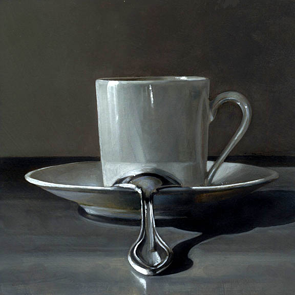
I'll be painting "studies" in the coming weeks to test some ideas for larger paintings I plan to use for a show at Twinhouse in January 2007. Since I intend to use a square format for all of the paintings in that show, I felt the six by six size I've been using for my auctions would be a good platform to experiment with theme and composition. One of my favorite themes is the coffee cup. I love the opalescent quality of the ceramic.
12 comments:
Very unusual composition. I love it.
I love your muted colors but darned that centered spoon would drive me crazy compositionally!
superb
Great new work. This one is nice, I like the scissors a lot. very nice colors and brushwork.
Very nice i love how the spoon is center stage
Amazing work. Truly beautiful pieces.
The Gray-scale seeps out beautifully and perhaps essentially in all your paintings, as it does in Espresso. Could you sometime write about how you execute the Black in your paintings...does that come as an essential lay-in as an under-painting? You chose an unforgiving composition with the spoon looking away at a 90. Brave of you, and many thanks.
Hello James,
Your work is amazing!
You are the best realistic painter that I ever seen online! I mean painting accurately and skilled you are definitely 0-10, a number 12!!!!!
I appreciate all of your kind comments. One of my goals is to eventually infuse my work with more color. I fear sometimes that I'm getting lost in a world of grey. I feel that I'm still very much in the infancy of my art career, and hope that I will have the courage to explore color more enthusiastically in the future.
The grey here is "alive" though and the whole is totally satisfying. I keep returning to look at this piece. I love your tonal scale but most of all the sense of quietness and integrity this painting has.
You paint spoons so well. I think the predominate grays makes it beautiful. It feels so solid and real.
I had an instructor in school who painted in very muted colors, and his work looked so much more realistic than all us students who couldn't figure out the mix and were either garishly bright or too muddy.
Post a Comment